
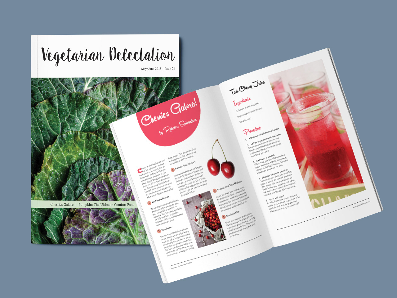
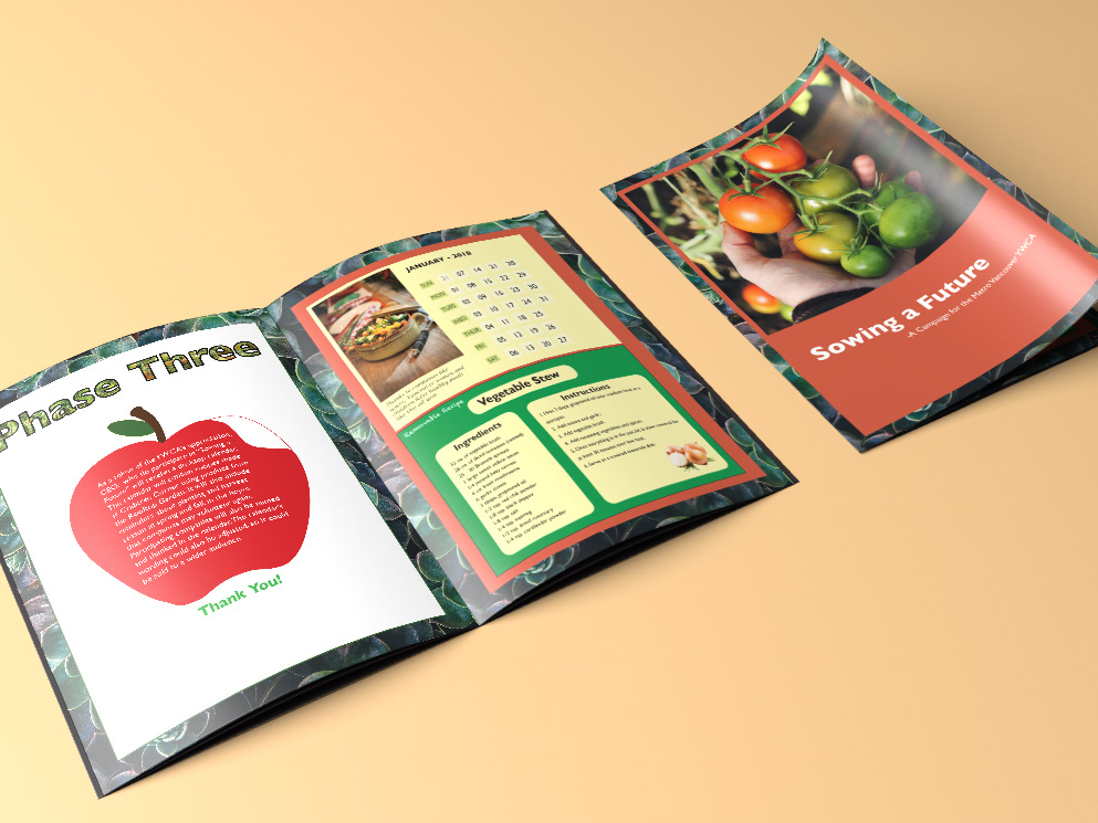
This layout is for a vegetarian magazine. The goal is to make healthy produce look delectable to the target market. The intended audience is primarily female, aged 25 – 50, and middle to upper class. They have either a vegetarian diet or want to incorporate more produce into their diets. A two-week deadline and target market considerations were the project constraints.
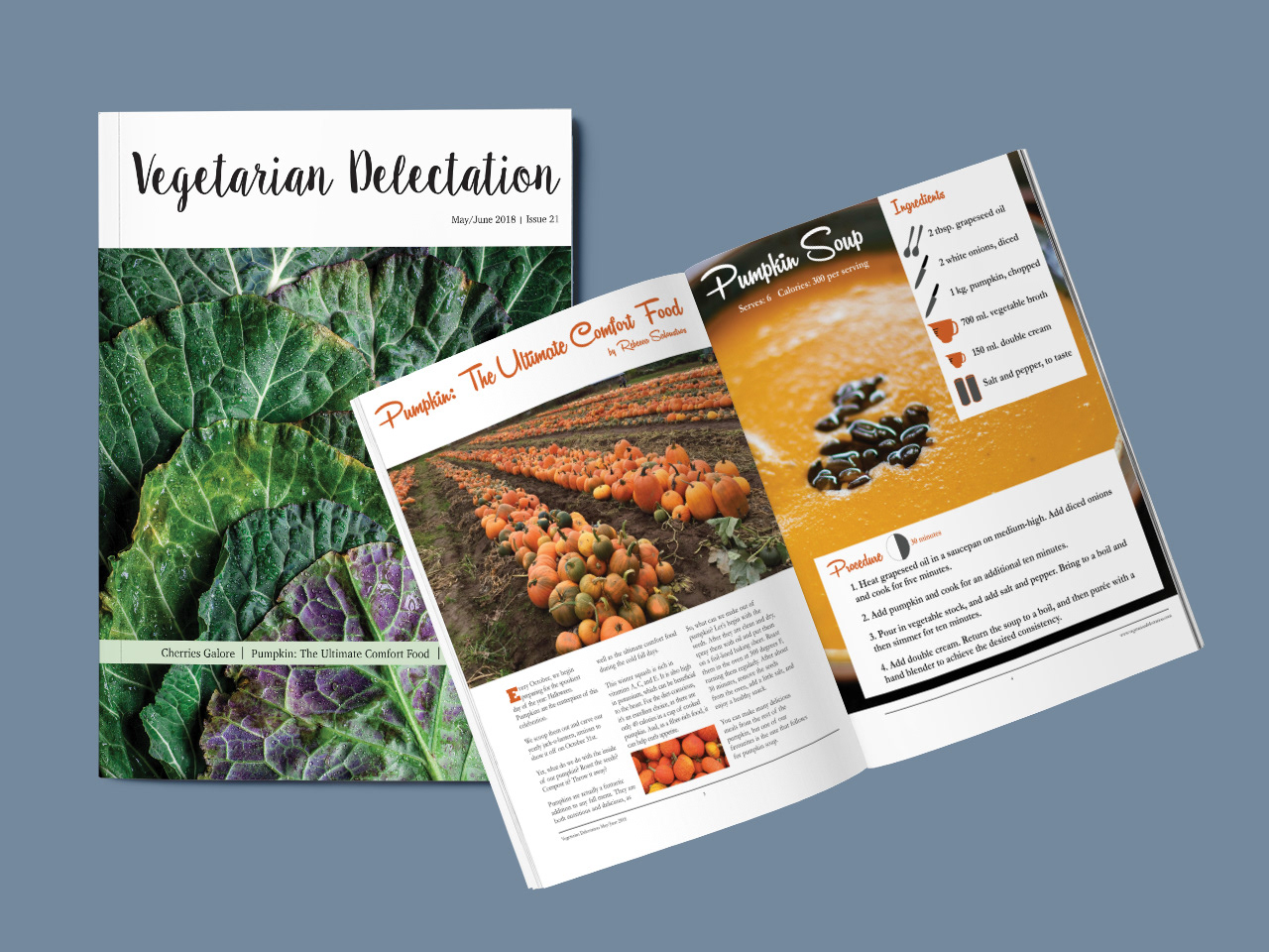
Fun, decorative typefaces were incorporated to reinforce the idea that cooking and eating vegetarian food can be enjoyable. On the cover, the heading is rendered in Sweet Pea Regular.
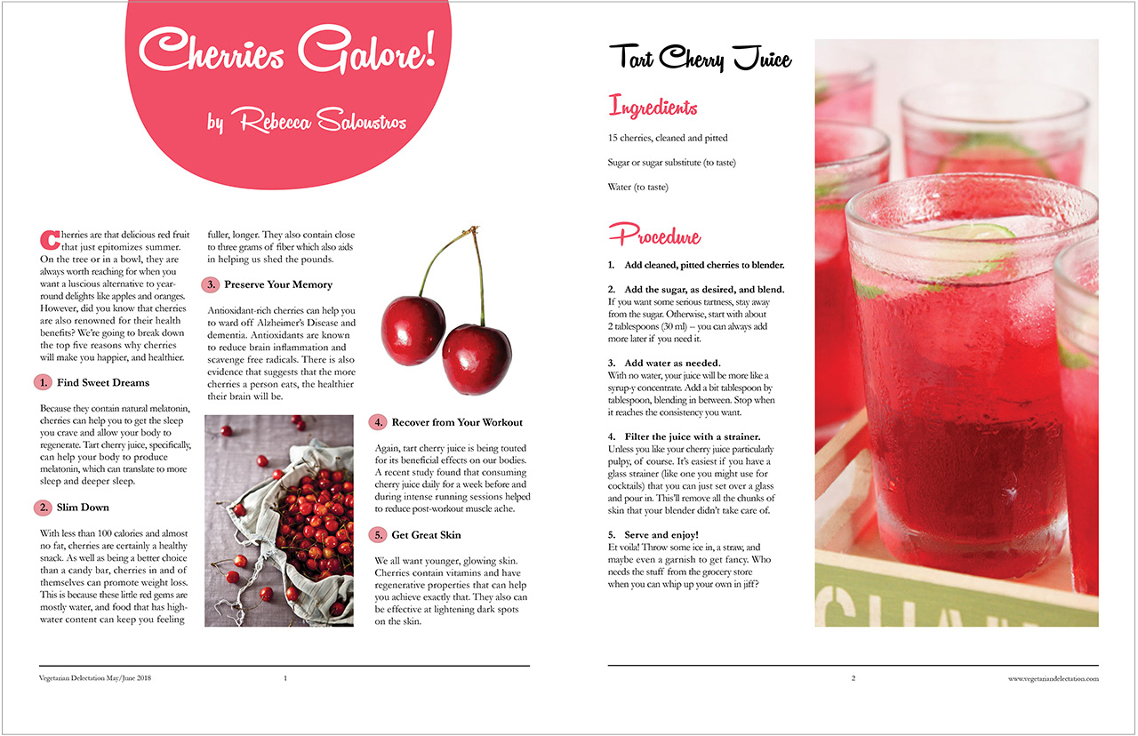
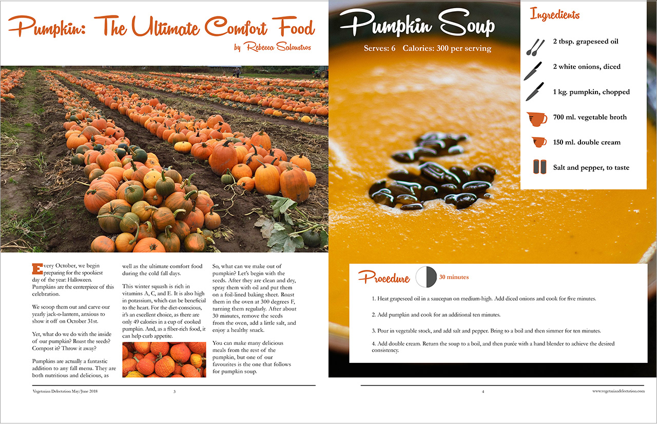
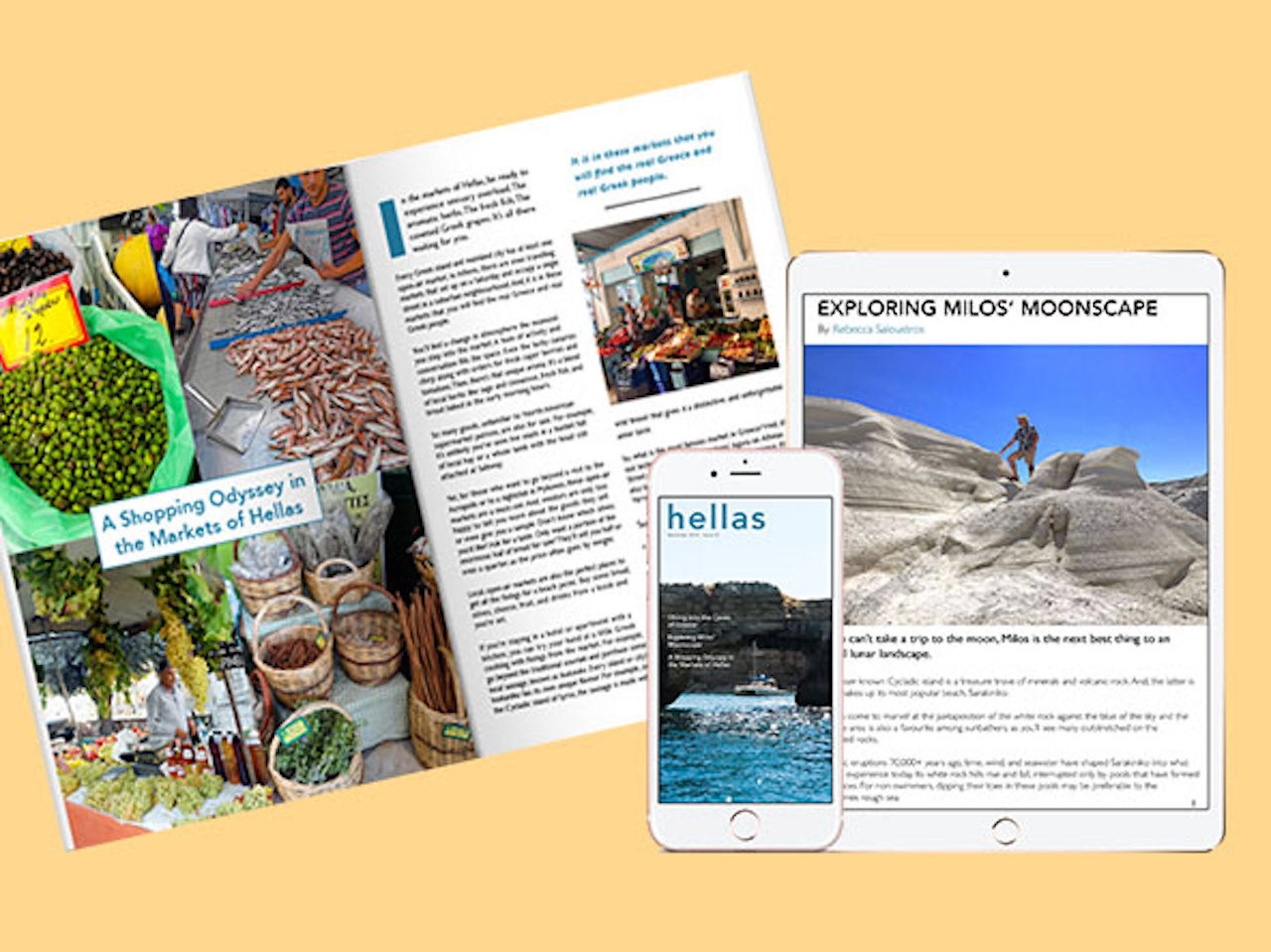
Again, the typeface used for the headings is eye-catching, Remachine Script. However, the focus for the body copy is for it to be easy-to-read. Thus, Garamond is used.
The colors throughout this piece are meant to mirror the vibrant colors in nature. This is to counter the perception that vegetarian food is dull.
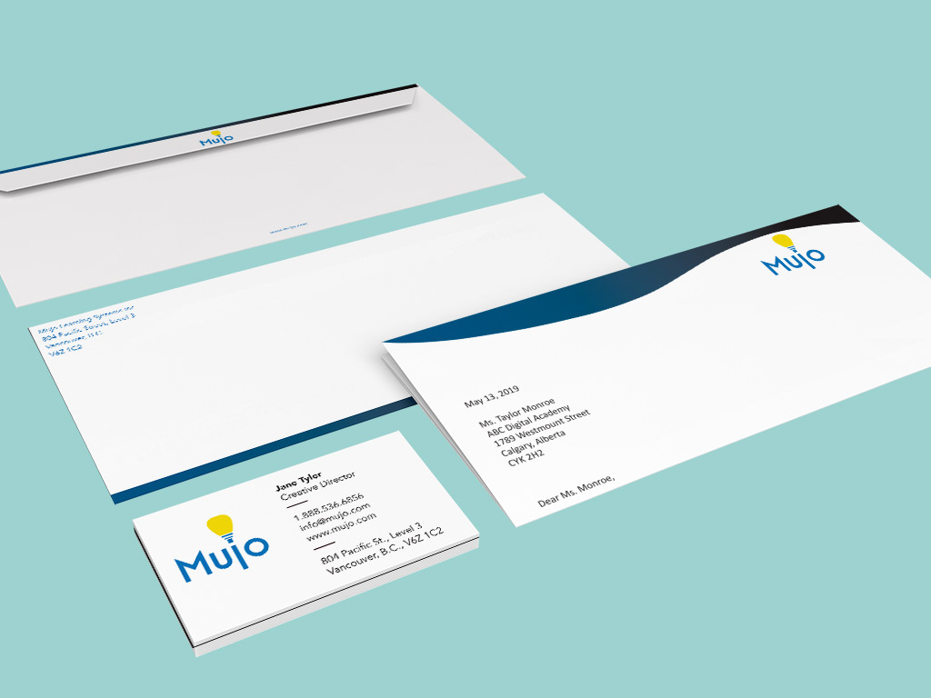
Platform: Print
Software Programs:
InDesign
Photoshop
Illustrator
Photo credits:
Cover page: Photo by Heather Gill on Unsplash
Cherries spread: Photos by Free-Photo on Pixabay, Paolo Neo on Wikipedia Commons, and Blogspot
Pumpkins spread: Photos by Rebecca Saloustros and Valeria Boltneva on Pexels
