This packaging design is for Verdant Tea. “Verdant”, means “green in tint or color; green with growing plants”. Thus, the packaging is intended to convey the business’ unique selling proposition that only the freshest, organic ingredients are used in the company’s products. The main constraint on this project, along with a tight deadline, was the necessity of designing for both looseleaf bags and tins. The placement of various elements on the design, as well as the size of the design, was important. For example, "60 g. (1.7 oz)" needed to be far enough away from the product edges, so it would not be cut off.

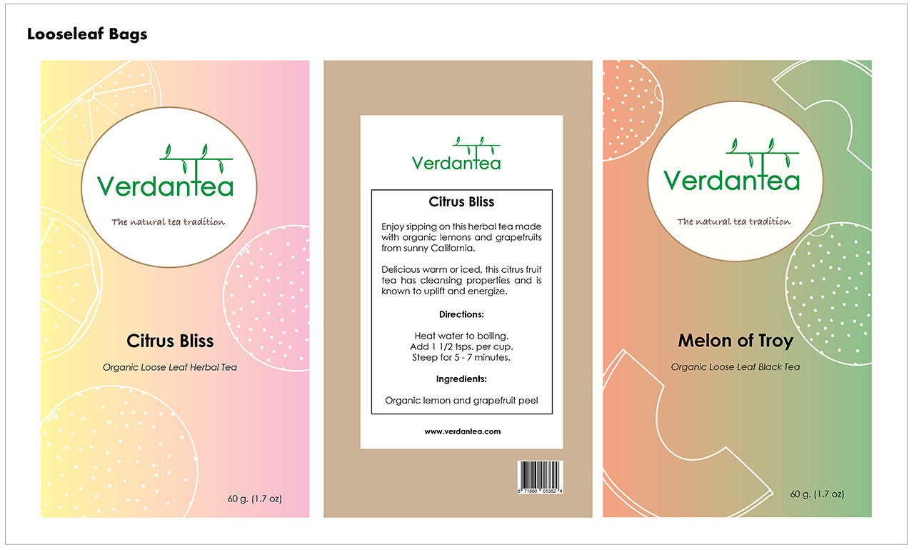
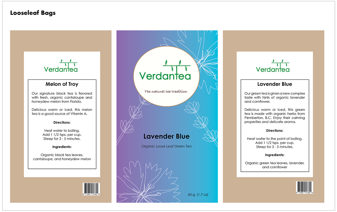
The typeface for the logo and body copy is Century Gothic. This typeface has more widely spaced letters than many other fonts and very clean lines. Thus, it should be easy to see from a distance on a shelf, and be easy to read. It's also important to make the font size large enough, so potential customers can read key information on the package even if they are a bit further away.

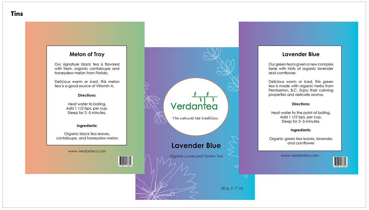
The colors on the bags and tins are gradients that represent the colors of the ingredients. The logo’s color is a vibrant, verdant green, evocative of the leaves of fresh fruit, herbs, and tea.

Platform: Print
Software Programs:
InDesign
Photoshop
Illustrator
Photo credit for tote bag: Casey Horner on Unsplash