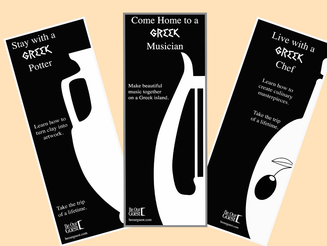
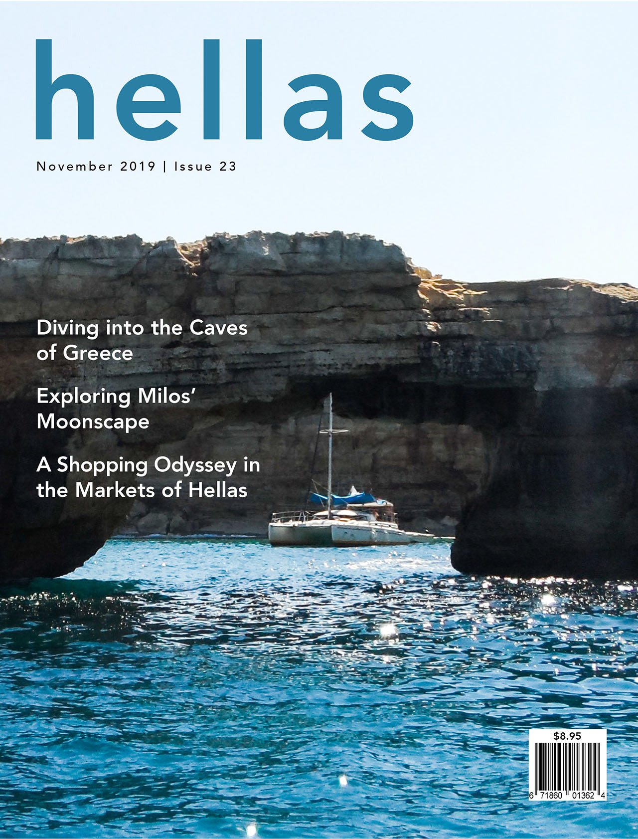
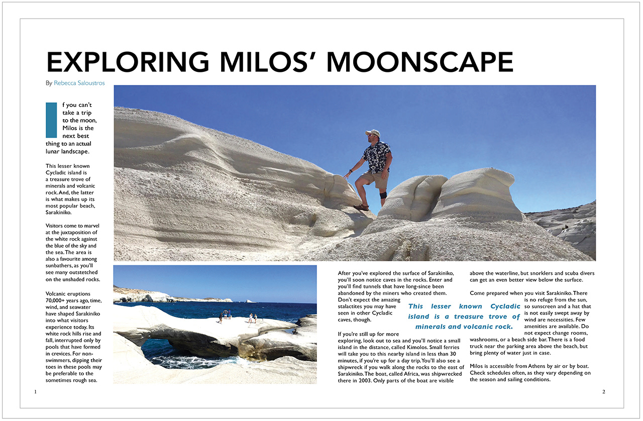
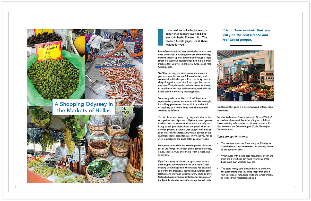
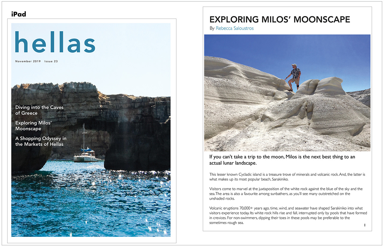
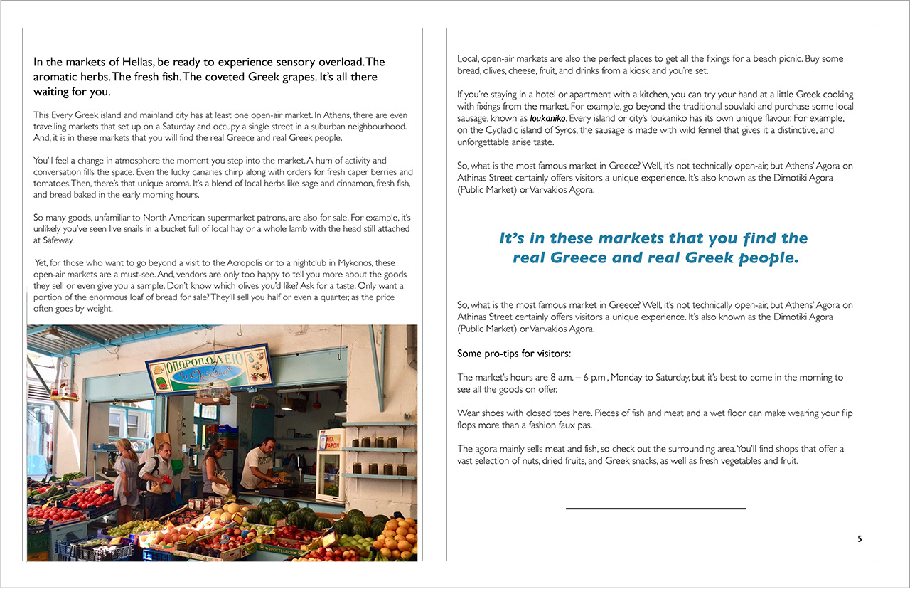
The goal of this design is to showcase the natural beauty of Greece and its local culture. Focusing on Milos’ “moonscape” and describing caves and a shipwreck that can be explored should appeal to the 18 – 30-year-old target audience. Also, showing local products in the Greek markets will invite those who want to avoid the more touristy locations, and interact with the average Greeks.
Appealing to a millennial audience that wants to see off-the-beaten path locations, along with a tight deadline, were the main constraints on this project.
The typeface used for the headings and logo is Avenir Heavy. Avenir is a modern typeface that has a minimalistic, clean look that should appeal to the target audience. It also will not distract from the powerful image presented.
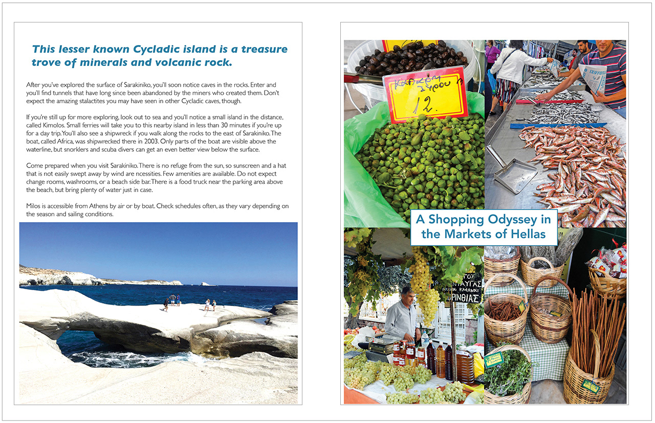
The body copy’s typeface is Gill Sans. It is also a very clean, easily readable typeface that does not distract from the imagery.
The principal color in these layouts is dark teal. This is very similar to the kind of green/blue appearance of the sea. Thus, it pairs well with the images featured in the design.
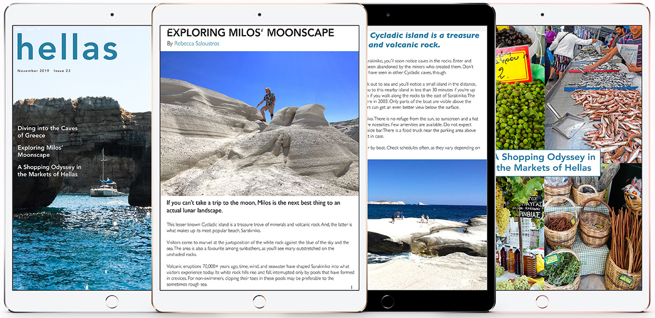
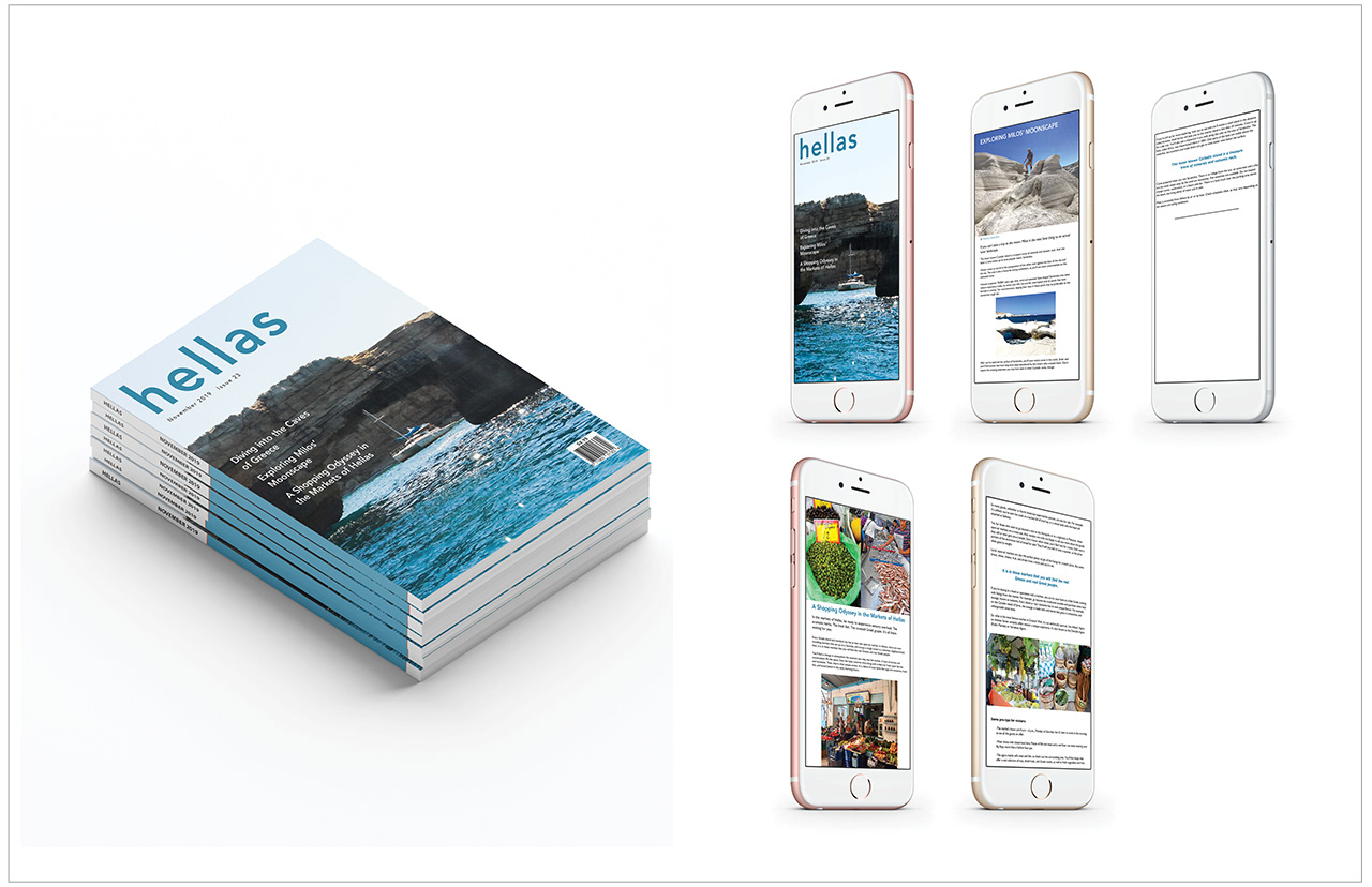
Platforms:
Print
Tablet
Mobile
Software Programs:
InDesign
Photoshop
Illustrator
Photo credits: Rebecca Saloustros