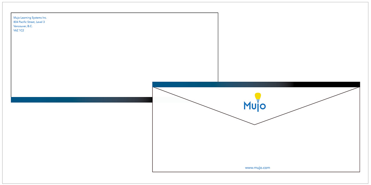
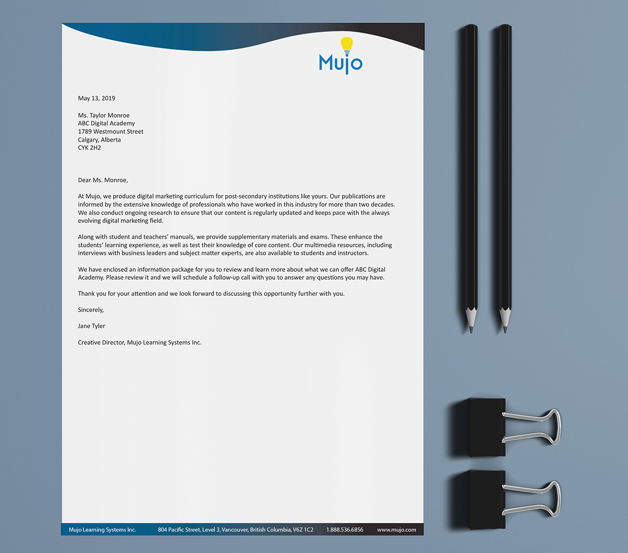
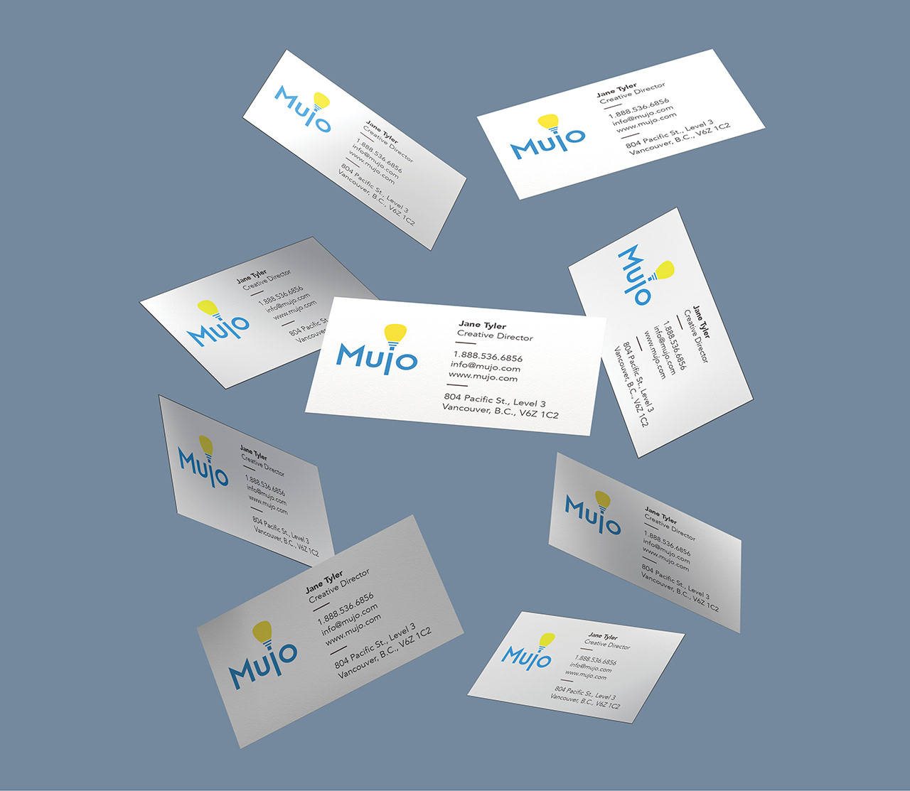
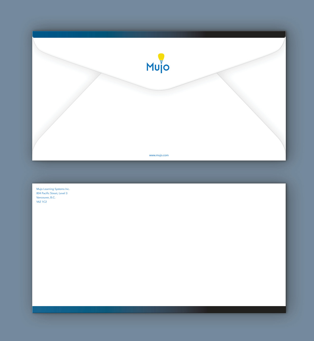
Mujo Learning Systems Inc. is a publisher of digital marketing post-secondary courseware, and they requested new letterhead. The project constraint was to use their brand colors, blue and white. Also, it was important to consider who would be receiving correspondence from the company, as well as business cards. The audience was primarily school administrators and teachers. Thus, the design needed to be tailored to appeal to a professional audience. Also, the design needed approval from the company president, and feedback was also requested from other employees before it was given the green light.
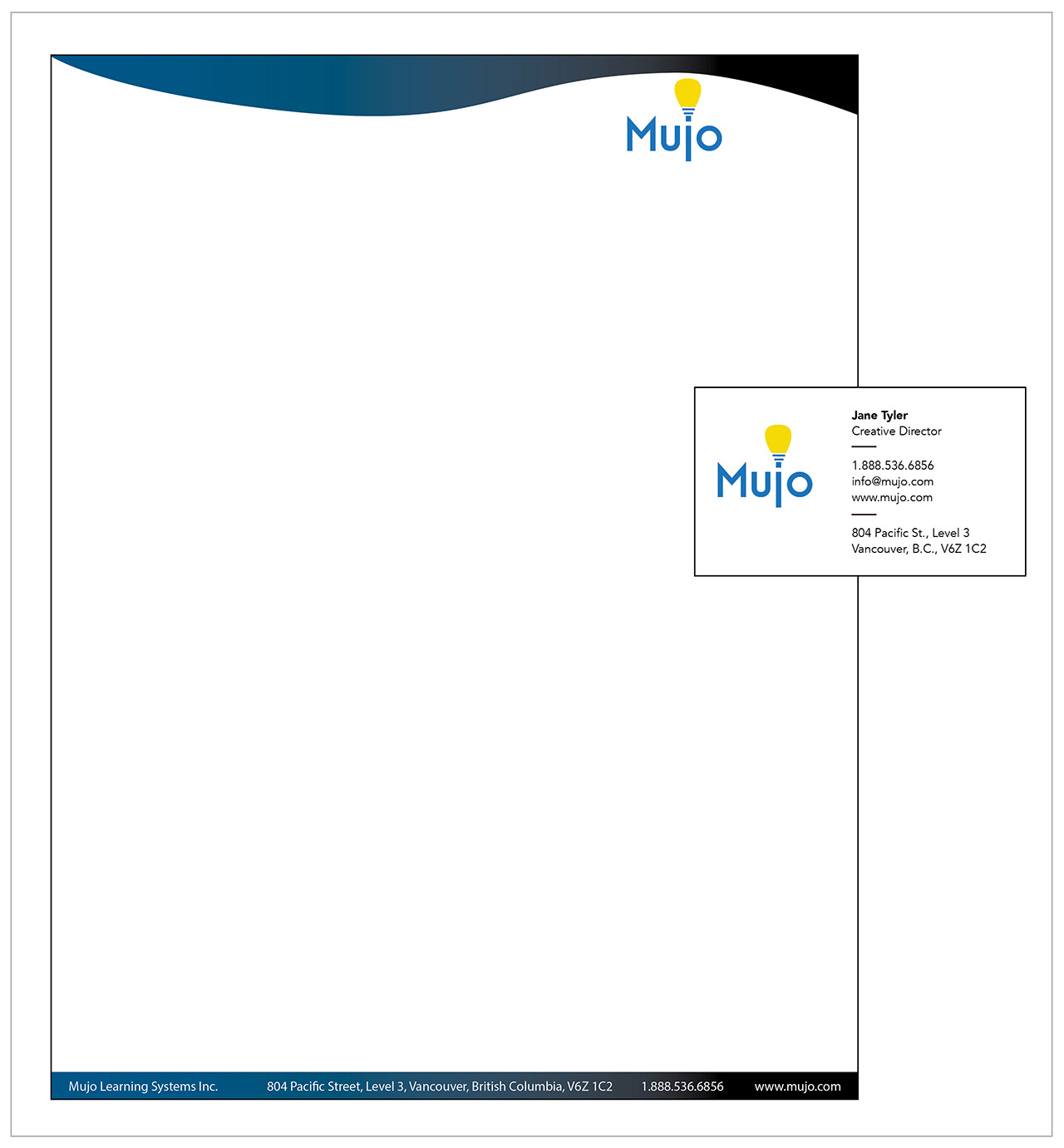
The logo represents the bright ideas and knowledge that will be ignited in the minds of students when they use Mujo’s curriculum. The logo’s typeface is Modern Sans. Its contemporary look is in keeping with the kind of materials Mujo produces.
Platform: Print
Software Programs:
InDesign
Photoshop
Illustrator